


Boost cloud security by combining Google SCC with co-managed IT for real-time threat detection and compliance.

August 18, 2025
.avif)
.avif)
.avif)
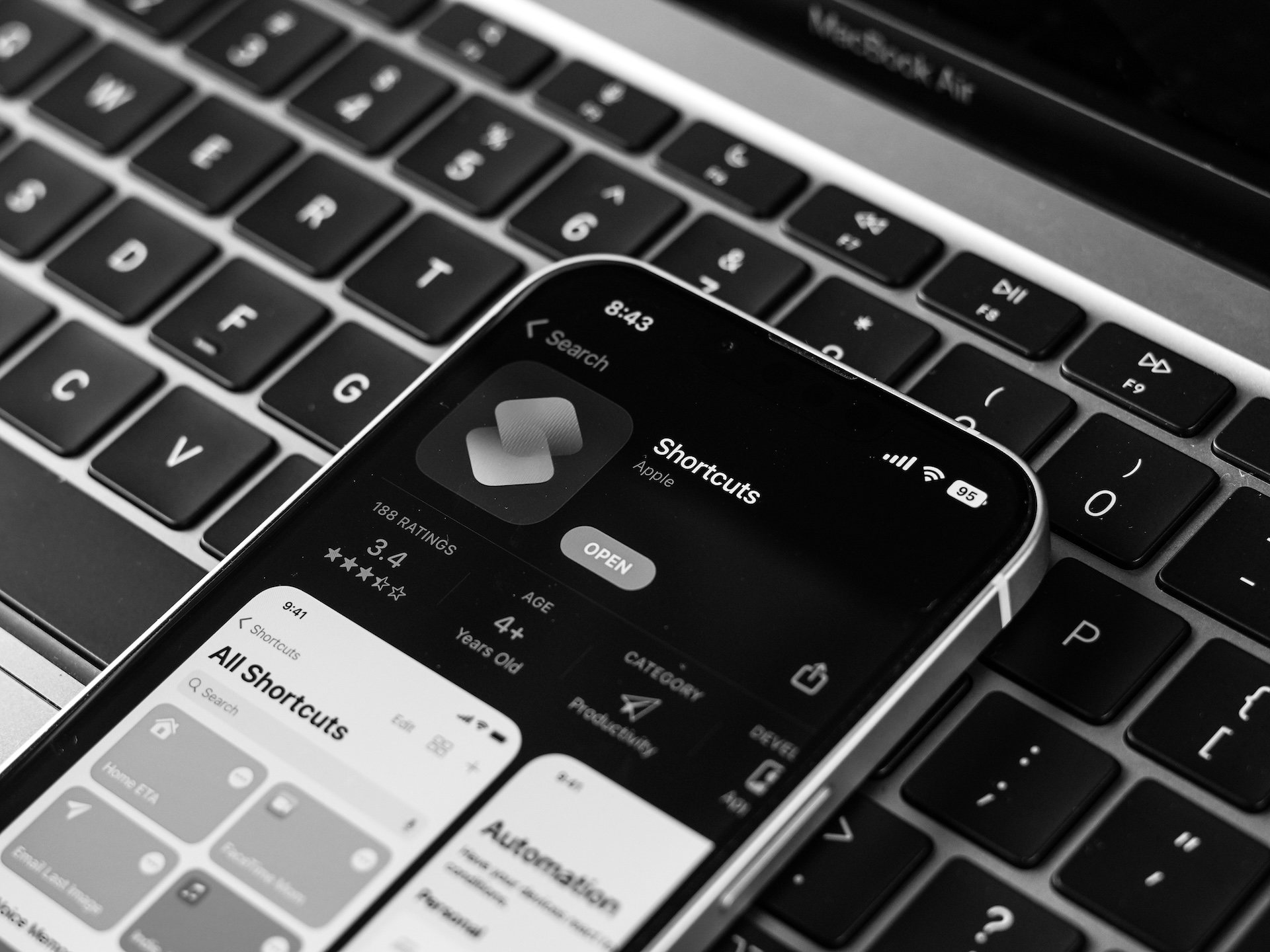
Building an app for Apple devices? Congratulations, you're addressing a market of over 1 billion users worldwide. But here's the challenge—those users are spread across a staggering variety of devices with different screen sizes and resolutions. From the compact iPhone SE to the expansive iPad Pro, optimizing your app for all these variations is critical. Why? Because a seamless, visually pleasing user experience will keep customers coming back.
This guide will walk you through the strategies and tools you need to ensure your iOS app looks and functions flawlessly—whether it’s opened on an iPhone 13 Mini or the latest iPad Pro. You'll learn how to handle the challenges of device diversity while leveraging the opportunities that come with reaching a broader audience. Let's get started.
Apple is known for its sleek, well-designed devices—but their wide range of models can be a headache for developers. Currently, Apple offers products like the iPhone (in multiple sizes), the iPad (from Mini to Pro), and even watches and TVs, all with varying screen dimensions and resolutions. These differences directly impact how your app will look and feel.
Key iOS Screen Sizes
Here’s a quick breakdown of some of the most common screen sizes among Apple’s products:
The resolution also varies considerably. For instance, high-end devices like the iPhone 15 Pro Max feature Super Retina XDR resolution, while older models like the iPhone SE utilize Retina resolution.
How Apple's Hardware Evolution Affects Apps
Apple consistently upgrades its displays, focusing on higher resolutions, better color accuracy, and features like HDR. This poses challenges for developers—but it also opens opportunities to use these enhancements for a richer user experience. Apps optimized for these advanced screens tend to grab more attention and maintain user engagement.
The Challenges
Developers face several hurdles when building apps for Apple’s diverse product lineup:
The Opportunities
On the flip side, optimizing your app opens the door to expand your audience. By adapting to various devices, you ensure your app is accessible to users who might otherwise be excluded. Additionally, using hardware-specific features allows you to create a ‘wow’ factor that sets your app apart from competitors.
Imagine leveraging the M2 chip in the iPad Pro to create immersive AR experiences or making use of the 120Hz ProMotion technology to deliver ultra-smooth visuals in a gaming app. These aren’t just technical add-ons—they’re selling points.
1. Design Flexible Layouts
“Auto Layout” is your best friend. Apple’s Auto Layout in Xcode ensures your app’s interface adapts dynamically to different screen sizes. It uses constraints and guides to adjust elements automatically, so your layout looks polished, whether it's on an iPhone or iPad.
2. Prioritize Adaptive Design
Adaptive design is all about responding to the device in use. Use the `traitCollection` class in iOS to detect the environment (for example, dark mode or light mode) and adjust your app’s appearance accordingly.
3. Use Scalable and Responsive Images
High-resolution screens demand high-quality images. Use vector graphics or scalable images to prevent pixelation when viewed on larger or more detailed displays. Also, ensure your images adapt depending on the device orientation (portrait or landscape).
4. Optimize Navigation for Larger Screens
iPads provide more screen real estate, so offer additional navigation layers like split views or multi-column interfaces. Conversely, simplify navigation for smaller screens.
5. Test Typography With Dynamic Type
Dynamic Type allows users to adjust font size according to their preferences. Make sure your app supports this by using Apple’s San Francisco as your default font, ensuring consistency across devices.
6. Adopt Apple's Human Interface Guidelines (HIG)
Apple provides detailed best-practice guides in their Human Interface Guidelines (HIG). By following these guidelines, you’re more likely to deliver an intuitive and visually appealing app.
The Importance of Testing
Testing is where you’ll discover whether your design decisions work across all devices. Even the most meticulously designed app can encounter issues when transitioning from a 6.1-inch iPhone 14 to an 11-inch iPad Air.
Efficient Testing Strategies
Pro tip: Don’t just test functionality—focus on how your visual elements adapt across devices.
Fortunately, Apple equips developers with a robust set of development tools:
If you’re just starting out, Apple’s developer portal (developer.apple.com) offers detailed guides, online courses, and forums for networking with other developers.
The Rise of AR and Mixed Reality
Apple’s new Vision Pro headset is a game-changer. With spatial computing at the forefront of tech trends, the future of optimization includes building apps compatible with Apple’s ecosystem, including ARKit.
Continuous Updates
Stay proactive. Apple’s ecosystem evolves quickly, with hardware and software updates introduced annually. Keep your app updated to benefit from the latest features and maintain user satisfaction.
Accessibility Features
Apple is a pioneer in accessibility. Features like VoiceOver, Dynamic Type, and AssistiveTouch can make your app more inclusive—and being inclusive means reaching a larger audience.
Stay Ahead With Expert Guidance
Mastering app optimization for Apple’s diverse ecosystem is no small feat, but when done correctly, it’s a game-changer for your business. A well-optimized app enhances user experience, builds brand loyalty, and, ultimately, boosts your bottom line.
Need help refining your iOS app? At POINT, we specialize in taking your app from good to exceptional.
Contact POINT now to get the most out of your Apple devices.